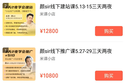
After the outbreak of foreign trade orders are becoming less and less, online channels began to shine, more and more people realize the role of independent stations. A large number of people began to build 2B foreign trade official website or 2C cross-border e-commerce website. Mi class Yan Sir offline station building class is hot, although the cost is up to more than 10,000, still in short supply to run a period after a period.
Many people say that foreign trade independent station is the next windfall for foreign trade enterprises, in fact, this sentence is only half right, the front should add "high traffic", "high conversion rate" these 2 prerequisites. No traffic, low conversion rate of the site is like no traffic, low purchase rate of the physical store, a waste of time and money rather than end early.
According to our understanding, the vast majority of websites shut down after 1-2 years of being online because of no traffic and low conversion rates that do not generate benefitsWe are very concerned about the conversion rate. We build foreign trade websites in addition to aesthetics also care about the conversion rate, incorporating many factors to improve the conversion rate and SEO effect factors.
Many people think that the independent station will be built up inquiries, orders, can not wait to build the station. When the site was built and found that the effect is not as expected, the inquiry is pathetic, and slowly the independent station began to be beaten into the cold. Compared with B2B platform independent station has a fatal flaw: no SEO optimization in the case of no natural traffic.
Currently, the only way to get traffic to a website is to drive traffic (advertising, development letters, affiliate marketing, social media, etc.) and to do Google search ranking optimization (SEO).
SEO optimization is the most cost-effective and the best way to attract traffic compared to advertising.Google SEO Optimization ServicesThe cost is low, the results are guaranteed, and no renewal is required.
High traffic + high conversion rate of the site is meaningful, foreign trade independent station must do to attract traffic, improve the conversion rate, one of the two is indispensable.
Why is conversion rate so important?
Conversion rate can greatly improve the amount of orders / inquiries, save advertising, traffic costs. Traffic alone, if the conversion rate does not work, it is likely that the basket is empty. Especially invested in Google / Facebook advertising sites, each click is less than a few dollars more than a dozen, two dozen dollars.
The average advertising cost of an inquiry can be as high as tens or even hundreds of dollars. Conversion rate and bounce rate are closely related and affect each other. When a website increases its conversion rate, the bounce rate will naturally decrease with it.
We have come into contact with many company leaders, who are very thoughtful and courageous, and put forward constructive modification requirements for the website. However, these requirements are not quite suitable for foreign customers' habits, and the website made may make the leaders very satisfied, but it may not help the conversion rate and may have negative effects.
The main purpose of writing this article is to share and discuss with you ways to improve conversion rates and learn from each other.
How to improve the conversion rate of foreign trade websites?
Increasing your website's conversion rate involves a number of things, including optimizing your website's content, improving the user experience, and implementing an effective marketing strategy. Here are some specific suggestions:
Clear value proposition:Make sure your website clearly communicates the value and benefits of your product or service. Emphasize what makes it unique compared to your competitors.
High-quality content:Provide valuable content such as white papers, case studies, blog posts and tutorials to showcase your expertise and industry leadership.
Optimized website design: An intuitive, easy-to-navigate website design is critical to improving user experience and conversions. Make sure your website works well on a variety of devices.
Search Engine Optimization (SEO): Improve your ranking in search engines by optimizing keywords, meta tags, content quality, etc. to attract more targeted customers.
Social Media and Content Marketing: Utilize social media platforms and content marketing to increase brand awareness and attract potential customers.
Emphasis on client evaluations and testimonials: Showcase customer reviews, testimonials and case studies to build trust and demonstrate the effectiveness of your product or service.
Adaptation and personalization:Use data and feedback to continually tweak your website and marketing strategies to ensure they meet the needs of your target audience.
Enhanced customer service and support:Providing exceptional customer service and support increases customer satisfaction, word-of-mouth and repeat business.
Regular tracking and analysis:Use tools such as Google Analytics to monitor website traffic, user behavior and conversion rates for continuous improvement.
The most effective strategies may vary by business, target audience and specific industry. When implementing these strategies, it's important to continually monitor results and be flexible to adapt your approach to changes.
Conversion rate involves the company's selling points, product advantages, the grasp of customer pain points and human nature, very profound. We only know the skinny, the following is our own business and access to relevant research information summary of the factors that have an impact on the conversion rate, if you have better ideas welcome to comment exchange together to improve the article.
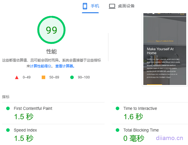
Optimize website speed
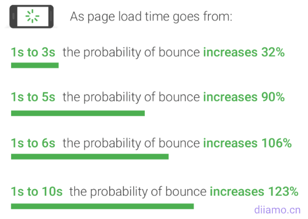
Pinterest reduces perceived wait time by 40% and directly increases search engine traffic and registrations by 15% . COOK reduces average page load time by 850 milliseconds, resulting in 7% more conversions, 7% fewer bounces, and 10% more page views per visitor.
Google says speed is the key to victory (Details.https://web.dev/why-speed-matters), and in June 2021 willCore Web Vitalsas one of the ranking factors. A slow website also increases the bounce rate and reduces the customer experience, which affects the inquiry/order conversion rate.
According to Google, as well as studies by several institutions, it has been shown that
- Page loading speed of more than 2 seconds, when visitors start to lose interest.
- 47% visitors want pages to load in 2 seconds or less.
- 40% visitors will abandon sites that take longer than 3 seconds to load.
- 79% Visitors who are not satisfied with the performance of the site are less likely to revisit.
- Akamai The study found that a 1-second increase in website latency reduces conversion rates by about 7%.
The chart below shows Google statistics, the green number on the left is the page load time and the green number on the right is the bounce rate. As the page load time increases, the bounce rate also increases significantly.
To improve website conversion rate and reduce bounce rate, optimizing website speed is a must. How to optimize WordPress website speed and open pages in seconds? The answer is all inThe Ultimate WordPress Speed Optimization Tutorial. If you can't read or are too busy, you can contact us by WeChat to optimize the speed of your website for you, a few hundred dollars to solve all the problems related to speed.
Trust Factor
The trust factor is the content that increases customer trust. Simply put, it is the content that makes customers trust us, feel good about us and want to work with us. Business is actually trust, the first thing customers consider when looking for suppliers is the issue of trust.
Only when you believe in the strength of a company, professionalism and so on will you place an order to the other side. Price is also important, but only first to obtain the trust of the customer to have the opportunity to bargain with the customer. Solve the problem of trust is the key to get foreign trade orders.
What specific content can improve customer trust? In fact, the website is equivalent to a development letter, usually you will write how to send a letter to gain customer trust you will put which content on the page. Here are a few of our suggestions for website content.
1- Add content such as customer reviews, success stories
I believe you have seen the customer reviews section in many websites, foreigners like to read reviews first when buying the same product, there are many foreign websites specializing in reviews. For example, Yelp, TripAdvisor, etc.. Adding a customer evaluation section to a foreign trade website definitely helps to improve trust.
2- About us page to write down company history/story, company vision, etc.
Companies/people with stories and personalities are more likely to gain empathy, recognition and trust. We often read articles related to building websites abroad and find thatEach oneThe authors of the articles all write 2-3 sentences describing personal information in their profiles.
For example, "love playing badminton with my husband and trying to beat him" and "love cats so much that I can stay with them all day". Some bloggers set up their profiles with personal experiences, such as the 50 most incredible things they've done, their life and journey from graduation to now, etc.
3- Increase the content of social responsibility and humanistic care
Many foreign companies write about social responsibility, do not work with sweatshops, donate to charities, etc.. It is to express themselves very formal, socially responsible, trustworthy, after all, no one wants to work with "bad companies".
Foreign trade websites are also recommended to put appropriate content, we have written on the home page of our own handbag website to attach importance to workers' life and welfare, providing satisfactory compensation and a safe and comfortable working environment.
4- Let customers know as much about us as possible
Trust comes from understanding. We are always wary of the unknown, and we are more receptive to familiar people and things. Let customers know as much as possible about us helps to improve trust. Try to introduce your company/products as much as possible, preferably with pictures + videos.
For example, production workshops, staff dinners/activities, professional company introduction videos in English, machinery and equipment, factory inspection reports, big customers we cooperate with, export countries and shares, etc. Trust comes from understanding, the more advantages you know, the higher the trust.
The above is just a suggestion, different from industry to industry. Some large customers will send a document (similar to factory inspection report) before cooperation with suppliers to fill out in order to better understand each other, that document to fill in the content is the customer care point, it is worth reference!
5- Create key pages to build credibility
About and Contact pages are a must. the About page is already mentioned above and the Contatc page should show the physical address, phone number, email, social media, etc. Users show that there is a real company behind our website, reliable and professional. It is also convenient for customers to contact us at any time.
Terms of Services, Privacy-policy pages and cookie collection alerts (usually pop-up notifications) are also essential. This is to comply with the EUGDPRPrivacy law, but also let consumers understand that this is a regular website, a regular company.
The terms of service inside the terms can also protect some of our rights and interests. If it is 2C website should also make a return policy page, so that consumers are clear about the conditions of return and exchange as well as the method, to avoid disputes later, to protect the rights and interests of both sides.
6- From the customer's point of view
We have seen many foreign websites and the feeling is very different. The domestic website is basically a yellow woman selling melons, mainly about the merits of their own company, and the merits with some water. Generally do not do the news page blog page, news page generally send some company holidays, activities and other developments.
Foreign websites are really good at marketing, the content of the website is written around the customer's pain points, starting from the customer's interests. Condense the company's selling point and customer accurate portrait, focus on marketing.
The vast majority of foreign trade enterprises for the first time do not know how the site is good, how should be done, basically choose a template to build a site, there is no design / marketing to speak of. Most of the construction companies do not understand foreign trade marketing, it they do not want to understand, as long as the template to do a little exquisite, and then blow their company how good on the line, domestic customers eat this set.
Our foreign trade website templates comply with the AIDA consumption model, marketing around customer pain points, and design to follow the fashion trend. All templates can be changed according to customer needs, and even build/imitate websites according to customer design drawings. For more details, please check ourWebsite Package Details.
Information Communication
It doesn't matter how good we make ourselves look, the customer has to get it. Don't brag about yourself too much, don't put a lot of advantages, this will be counterproductive. Pick the key content to express, moderate expression, and key information and key information to add hyperlinks between each other to guide customers to click.
The website menu/navigation is as simple and clear as possible, easy to understand, and convenient for visitors to identify and understand. Product categories as far as possible to control the 3-6 categories, too few categories unclear customers can not easily find what they want, too many categories too detailed is also not good to understand, find.
There are 2 customers reflected that their products just have many kinds and many models, must be divided into many categories. In this case, it is recommended to make 2-3 websites and divide all products into 2-3 major categories and then put them into different websites separately to market.
Or just put the important categories into the website, other categories with a little text or picture description to let customers know we can do it, no need to create additional categories to upload to the site, and then add categories or new website to do up.
Text layout also requires a little skill. Most people read with a Z- or F-shaped eye scan, so putting key text in the Z and F trajectories is good for customers to get information.
50% U.S. PopulationReading level below 8th gradeTry to use short sentences and paragraphs and simple grammar.Hemingway is a free online tool that pastes sentences into the box on the left and gives suggestions on how they should be modified to improve readability.
Minimize the steps by making the client think as little as possible
According to a study by a foreign organization, visitors to B2C e-commerce websitesEachThe average dwell time on a page is about 45 seconds, for B2B this is about 80 seconds. The total dwell time (average session length) for the entire site is usually between 2 and 3 minutes.
Every time a customer thinks, every time they click, it increases bounce intent and decreases conversion rates. Try not to let customers think, reduce the number of customer clicks is conducive to improve user experience and conversion rate.
Video>Image/Icon>Text
One of the reasons for the success of Jitterbit is that it is in the form of video, which can convey more information than pictures, text and audio and is more infectious. Customer reviews and company presentations, etc. will work much better than graphics if they are displayed in video form.
Video also has disadvantages, viewing time is long easy to get the point, slow loading speed. Some of the simpler content would be better expressed in pictures. A single image may convey the same information as 1000 words.
If we want to describe the factory environment is good, the workers are happy working with us, the compensation is reasonable, the company often organizes activities and so on, we may have to use many words to describe it, and the customers will read it very stiffly.
If it is accompanied by a photo of workers playing basketball or doing an activity, with a smile on the face, and a picture of a tall and neat workshop or building in the background, the customer will be able to get the message we want to convey at a glance.
The advantage of icons is that the information is simple and prominent, suitable for conveying brief information, but also can play a beautifying effect of page layout. Generally, the company's selling point or some paragraphs of the description of the text in front of the icon will be added, visitors will know at a glance the text is probably about what content, icon + text also seems less stiff and boring.
Online Chat Tools
Many websites install online chat tools such as WhatsAp, Facebook Messenger, Tidio chat software, etc. The advantage of online chat software is that you can communicate with your customers instantly online, which is much more efficient than email communication and naturally has a higher conversion rate. You can also get customer contact information to carry out follow-up communication.
But online chatting has its drawbacks.
1- These plugins slow down the site.
2- Online communication requires high English ability, product expertise and responsiveness of the salesperson, if a question is asked and the words are not expressed, it affects the first impression of the customer.
3- Need to keep an eye on the information to do timely reply, more than 1 minute no reply customers began to leave one after another, time difference reason is difficult to do timely reply. I remember the god of material or Yi Bing said that we should try not to choose online communication by email, and we can take our time to think about how to reply and organize the language.
Of course, if your English is very good, the product and so very familiar with professional, when I did not say. The god of information has introduced the charm of Cool Call, that is mainly used to promote the single, we can be fully prepared before giving customers a call. Not the same as the first contact with customers online chat.
Do not do online communication function according to their own situation analysis, there is no right or wrong, only appropriate or not. whatsAp, Facebook Messenger and other online communication is the benefit of knowing the customer's cell phone number / Facebook account, late reply can also contact the customer, the disadvantage is that the customer's cell phone / computer to install the appropriate software, the computer side of the chat customer to scan the code to log in Chatting.
Tidio, Live Chat and other online chats are the most convenient for customers to initiate a chat directly without logging into their accounts by filling in their email and name. You must set the customer to enter the email, name and other information first before you can initiate the chat. The disadvantage is that we need to install the app on the computer/phone to remind the customer to send a message in time. If you reply late, you may not be able to contact the customer.
We generally recommend to do click on the pop-up message + WhatsApp. most foreign customers like to message information, do not like to chat online, did Ali International Station people know more clearly not many customers will choose to communicate online, online chat is also directly ask the price and so on, and then play disappear.
Some customers willing to communicate online will be willing to scan the code to log in WhatsApp to send messages over (cell phone side directly call app chat without scanning login). Our foreign trade website has a lot of customers contacting us through WhatsApp, which is more convenient to communicate, and you can also build a group to pull colleagues in. Sending files, viewing chat records and so on is more convenient, and the communication experience is much better than Tidio and so on.
Some studies say that most orders from 2C cross-border e-commerce standalone sites are the result of impulse spending by visitors (similar to Poundland), where customers don't necessarily need the product, they just buy it on a whim and feel good about it.
2C e-commerce website to convert high must not give customers time to think and wait. It is best to let customers place orders immediately and complete payment as soon as possible. If there is a professional customer service, 2C website or do online communication is better, customer experience is better, but also timely response.
If you do not have that condition does not matter, Amazon and so are no customer service, product descriptions are also super short, even the details of the picture only 2-3, the customer self-service orders.
Multilingual/Multisite
Many customers will ask to do multilingual translation, thinking that there is more customers in one more language. We have to explain the advantages and disadvantages of multilingualism to our customers every time to advise them not to do multilingualism. 2B websites we do not recommend doing multilingualism unless your company is deeply involved in small languages, or the target customers are not good at English.
2B websites doing multi-language will not bring much orders/profits, and the multi-language translation feature will instead slow down the page loading speed and may even affect Google SEO results. Why multi-language will not bring more orders/profits?
English is a very common language, and it is basically spoken in countries with good economies. Foreign import/export companies must speak English, and English is a workplace language. If a foreign company's buyer/owner does not speak English, it is likely that the company purchases from local or neighboring countries and does not import from China.
Even if a foreign company that does not speak English sends an inquiry to a Chinese supplier, it is likely to just ask the price to test it out, and the order volume is usually very small. Step back, even if the customer does not know English, customers also know how to use translation software, use English to find, contact suppliers. Because the vast majority of resources on the Internet are in English.
Another reason why multilingualism is not recommended for 2B websites is that it is difficult to do well in multiple languages. Machine translation accuracy will not be as good for small languages, and customers may feel that the words don't make sense when they read them. Specialized small languages require manual correction of the translation, making pictures according to the local market and so on. Communicating with small language customers through translation software is also a problem. It takes several times as much effort to get orders from small language clients, but the profit generated may be less than half of that of English clients.
In summary, 2B websites do not actually bring quality customers as well as orders in multiple languages, it is likely to be just a bamboo basket, a waste of effort. Doing business is to have trade-offs, the main time and effort on the things that can bring great profits above. Want everything, you may end up getting nothing.
If your company's 2B business/products are deep into the small language market, with local branches, sales and so on, then you can do multilingual. 2C cross-border e-commerce websites are also recommended to do multilingual, and it is best to do multi-site if you have the ability to have a team, one site in one language. Different sites can have different pricing strategies, different currency display prices, different payment methods, different promotional methods, different page layouts, decoration styles, etc.
Customers like to order without communication, which is helpful for order growth. Multi-site requires each site to upload products separately and so on, which is time-consuming and laborious.
No professional team or do not need to set different prices for different languages and so on, do a stand-alone site on the line, withTranslatePressThe translation of the plug-in to achieve multilingual functionality, with SEO effects can do Google ranking traffic.
Mobile Optimization
According toPaypal Research: Mobile pages are optimized to increase sales for 30%, unique identity views for 40%, and total product sales for 70%, and to reduce site bounce rates for 50%.
Research shows that the website 60% more than traffic from the mobile side, the mobile side of the website has become the main battlefield of the website, if you have not paid attention to it hurry up to get! If you have invested in Google ads you will find that only set in the computer side of the traffic will be very little, a day can not burn much money. If you set the cell phone, then more advertising quota can be consumed.
The overall browsing experience on the mobile side is worse than that on the computer side. The text, pictures, size and everything else on the mobile side looks smaller, the layout is very restricted, and the page loading speed is also worse. Optimizing the mobile side also brings higher traffic and conversion rate than the computer side, so it is necessary to optimize the mobile side in particular. Now not many people pay attention to this, as long as we do what others did not go to do, is an opportunity.
At least 8px (pixels) between the content of each section on mobile, try not to collapse the content to affect the browsing experience, and try to keep the copy as simple as possible.
In-depth customer profiling
Specific measures such as conducting customer research or monitoring website browsing help find customer pain points and suggest the best optimization solutions based on customer needs. One company has used this approach to adjust its customer service support strategy and has improved customer satisfaction by 8,00% and reduced churn by nearly 60%.
Data such as clicks, downloads, and time on page can be important metrics for evaluating customer engagement. You can create a heat map of your website's user journey, covering the entire process from home page login to checkout, to visually show the point at which customers abandon a purchase and determine if the abandonment is caused by user experience issues.
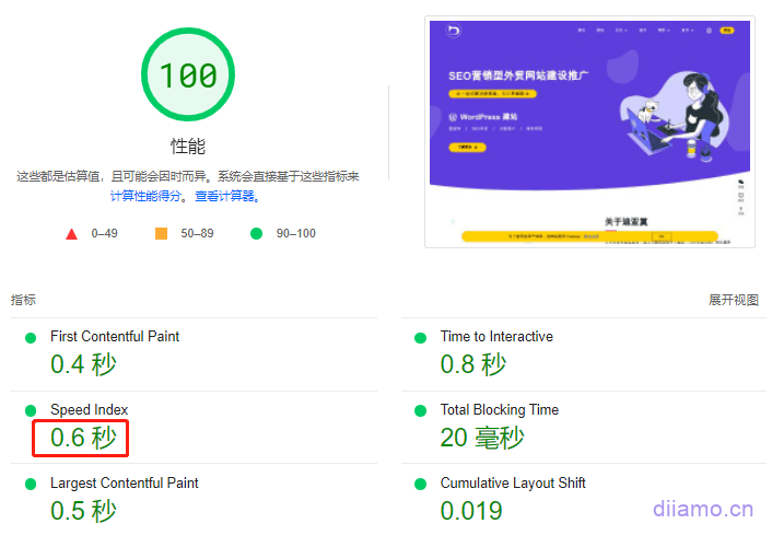
Optimize page loading speed
Speed is critical when it comes to user experience. AConsumer Researchshows that the stress response to page load speed delays is similar to watching a horror movie or solving a math problem, and is more stressful than waiting in line at a retail store checkout. It is highly recommended to optimize website speed especially on mobile.
Speed is the key to victory. Details.https://web.dev/why-speed-matters.
Pinterest reduced perceived wait time by 40% and increased search engine traffic and registrations by 15% directly.
COOK reduced the average page load time by 850 milliseconds, resulting in 7% more conversions, 7% fewer bounces, and 10% more page views per visitor.
We produce foreign trade websites with a loading speed of less than 1 second on the mobile side and less than 2 seconds on the mobile side. We launched a separate optimization of WordPress website speed services, there is a need to contact the right side of the WeChat customer service.
Google AMP
AMP is a page acceleration program launched by Google, which simply means that by deleting the page features and streamlining the layout to play the purpose of accelerating the site. AMP was very hot in the first few years, because it can greatly improve the speed of mobile, to know the speed of mobile is very difficult to optimize.
But AMP popular after a period of time we found not quite right, the site conversion rate dropped more than 50%! This is to be expected, originally the page is beautiful like a flower girl with makeup dressed beautifully.
Now AMP to remove people's makeup, replaced with a very plain kind of factory jumpsuit, the success rate of dating naturally greatly reduced. So people one after another began to abandon the AMP plug-in, Google official also said the future does not have expectations of AMP, now do not recommend that you use AMP.
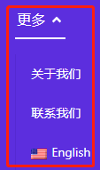
Use less drop-down menus, mobile hamburger menu buttons
Many people like to use the drop-down menu↓ and use the hamburger button↓ to link menus on the mobile side.
![]()
The drop-down menu can hide a lot of content, while making the page simple, so many people like to use, also used to use. But the drop-down menu willLower conversion rateBecause visitors will not click on the content of the drop-down menu, the drop-down menu involves a lot of code and also slows down the site. We are now making websites with less or no drop-down menus.
1- Visitors won't click on content they can't see, the dropdown menu requires additional clicks.
Instead of clicking directly on the content they want to view, visitors need to point their cursor or press a menu button (move) and then select the item. These are two actions, and the extra action required reduces conversion rates. This is why many e-commerce sites have one-page checkouts.
And customers don't know what's inside the drop-down menu, so they rarely take the initiative to click to view/drop-down menu content. Visitors to the site are like shopping, they don't know what stores are available and they don't know the map. They just walk around and see what they are interested in (content) and check it out.
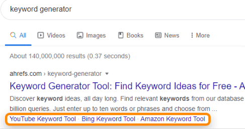
That's why professional, high-converting websites don't do drop-down menus, but instead just list the important content directly. The big namesYoutubeThe website ↓ will not have a drop-down menu, and will directly write out all the important content that customers will see before they click.
Youtube traffic is very high and earns a lot of advertising money every year, and its server and broadband costs are also very high (cf: JitterbugServer and broadband costs are several hundred million per day). Even if the conversion rate is increased by one thousandth, Youtube's profit can be increased a lot. Believe in the capitalist's brain and insight, abandon the drop-down menu.

Jitterbug ↓ The official website also does not have a drop-down menu
Some people may argue that e-commerce sites like Amazon and Taobao have a lot of drop-down (secondary and tertiary) menus, how can you explain this? Think about it: How do you usually browse through products when you visit an e-commerce site? Do you methodically browse through the drop-down category menus to find what you want, or do you randomly click on attractive, interesting content on the page?
Even when we know what we want, we still like to explore! The truth is, users don't really know what they want. They are biased to click on whatever shiny thing that catches their attention. By listing the important content directly, customers are much more likely to click on it. Don't put navigation and top of the site.
About Us, Contact Us and other content that is not of particular interest to customers should not be placed in the navigation, you can add the corresponding links in the main page to guide customers to click. home is also not recommended to put navigation, directly in the header LOGO to add links to the home page instead.
Our website started out with the drop-down menu pictured below, and then we put the whole "More" drop-down menu is deleted and replaced with the "Contact"The entrance is placed inside the sidebar in the image below, which is more intuitive. Put the "About Us"Links are placed in the footer and in some important page content.

2- Drop-down menus affect speed and user experience.
If you have visited our website before, you will find that the menu will pop up to the left when the page is loaded at the beginning, and the phenomenon of wobbling occurs. This is because the navigation has a red box drop-down menu as shown below, and the text content is loaded at the beginning of the load, and then the arrow icon of the drop-down menu is loaded after a whilevIt will squeeze the text to the left, causing it to pop up to the left, which affects the customer experience.
![]()
We used Eelmentor to create our navigation menu, and looking at the source code we found that this drop-down menu icon involved many JS files and CSS files! In order to display this icon as soon as possible we need to exclude several JS from being loaded late and add the corresponding CSS to the list of generated key CSS, resulting in a longer page load time.
The speed and customer experience of this site would be improved if we didn't use the drop down menus! So we later removed all drop-down menus inside the navigation bar ↓.
The old navigation of this site, with drop-down menu↓
![]()
New navigation after removing the drop-down menu↓
![]()
We just don't recommend using drop-down menus for header/navigation, but that doesn't mean they are bad. There are some scenarios that are perfect for using drop-down menus, such as
Account > Profile > Settings > Logout
Help > Support > Submit a Work Order > Documentation
Returns > Refund Policy > Submit a Return Request > Check Return Status
Banner (Poster) Slideshow
Basically, every client requires a Banner (poster) multi-picture rotation slideshow to be placed at the top of the home page, with many pictures stuffed inside. The client thinks that the more images they put, the better the result will be. But in reality, it is not the case.Banner (Poster) Multi-image rotating slideshow does more harm than good!
The code of the Banner slideshow is very heavy and is placed in the most critical position at the top of the home page, greatlySlowing down page loading speedand thusImpact on SEO rankingEffects andConversion rateThe harm is very great! Click to view6 reasons why rotograms reduce conversion rates.
Many customers think that the more pictures the better the publicity effect, in fact, foreign professional institutions research shows that only 1% of visitors will click to switch slides to view. 99% of visitors just look at the first Banner picture and then slide down the page. banner slides simply do not exist.
Website is made to foreign customers, the purpose is to make money, not to do to the leadership to see the leadership satisfaction. Strongly recommend that you do not do Banner slideshow, we 2B build a website template is only put a picture, resolutely resist Banner slideshow.
It is recommended that 2B website banner only put a picture, refine 1-2 most convincing selling points on the top of the picture can be, do not do slide rotation, so the effect and conversion rate is the best! If you want to put other selling points and so on can be placed under the banner picture more conspicuous, absolutely better than in the Banner rotation effect.
For 2C websites, there are some cases where Banner slides can be used appropriately. Foreign prices are high, coupons and discounts help a lot to attract customers to place orders, and businesses like to have events (e.g. Black Friday). Most foreign 2C websites will put coupons, special offers, and promotions in the Banner image, and visitors will know that there are special offers in the banner rotating image and will go through it.
It is recommended not to P the text inside the image, but to add it above the image using code. This way the text is displayed clearly on all sizes of devices, can be indexed by Google (with SEO effect) and can be translated for multilingual websites. Our premium build or above packages will load the text on the poster image, and you can ask your builder to do the same.
Tab (tab) display content
We have met many customers who like to use the following figure ↓ this kind of Tab display content, especially the About Us page and product details page. Another reason why we don't recommend Tabs for product detail pages is that it will affect SEO. if the page has too much of the same text and content, it will be judged as homogeneous, and Google doesn't like homogeneous content and won't give good rankings.
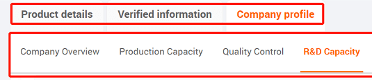
According to foreign research, customers rarely click to view Tab content voluntarily. We suggest to write out the content directly and put it on the same page to facilitate customers' browsing, and not to engage in such Tab display, especially for product detail pages.
Some customers feedback that the Ali international site product details page also use Tab display, people Ali Tab display is the company information. If each product details page company information directly and product details put together will seem too long, and the company information customers only need to see once is enough, so the form of Tab display.
The role of Tab is actually to hide the unimportant content, simplify the page, highlight the key information, visitors want to view the time and can easily view. So do not put important content in Tabs, just write it all out directly. Do not need to directly display or customers interested in the content will certainly click on their own can be placed in Tabs storage.
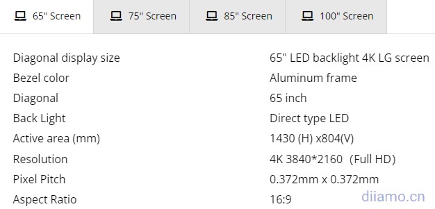
The following figure is Tab put the content of each size, this kind of content put Tab is quite good, usually will not take up too much space, customers like and can easily view.
Products, article rotation/slideshow
Many people like to use a rotating/slideshow format to display products and articles on the homepage, thinking that it will show more products and save space (especially on mobile). We feel that this is not conducive to conversions and we do not actively use rotations on our clients' websites.
One is that the JS code of the rotation affects the page loading speed, and the other is that the rotation is not good for the display of information. Customers will not necessarily take the initiative to click the rotation arrow to view other products, articles, rotation may play a counterproductive role. It is recommended to directly display all products and articles, 1 line can not be placed on 2 lines, try not to exceed 2 lines.
Advertising pop-ups
Two clients asked us to add ad pop-ups to their websites, so that every time they open a page, ads, inquiry forms, and subscription windows automatically pop up for customers to fill out. This is definitely a domestic marketing idea, many domestic websites like to engage in this, especially medical and service websites, bombarded to the point where customers are overwhelmed.
The above picture is a peer website pop-up ads, every page has, after closing a few seconds pop-up again. Block the content of the page can not be closed, you say it is not annoying. Some people will say that the effect is good to play a hint to guide the effect, the probability of customers leaving information to contact customer service increased. For their own benefit deliberately make the customer uncomfortable, smart customers will think what? This is a matter of opinion, I do not comment too much.
This set is only suitable for the domestic environment, not for foreign, I have not seen a foreign site so engaged. If foreign trade get this frequent advertising pop-ups customers will feel very annoyed, immediately leave. And so large pop-ups blocking the content is very affect the customer browsing experience. Content under so much effort to optimize, the results because of a pop-up window before the work abandoned, it is not worth.
It is recommended to pop up the window only once and shrink it into a button not to actively pop up again after closing. It can also be set to display only on certain pages, or after the user scrolls down the page 50% or more, to reduce the disturbance to the customer, yet let the customer know it exists and can find it.
Click on the inquiry pop-up window
Try to put a inquiry button (click on the pop-up message window) or form in a conspicuous place on each page to hint to guide customers to send inquiries, and also to facilitate customers to leave messages to us. Generally, the inquiry form is placed at the bottom of the home page, contact us page, footer or side toolbar.
We build the site will simultaneously make the inquiry popup button + page forward share button + WhatsApp chat button + Totop back to the top button all inside the side floating window section, so that it is convenient and subjective.
Social media forwarding and sharing function
Most of the websites have social networking site sharing function, so that visitors can easily share the page to their Facebook, Twitter and other pages, or send email, WhatsApp, Skype to their friends, print, etc.
![]()
If the page content is of high quality, visitors will be happy to forward and share it to their own website or social accounts, which will bring external links and traffic to the website and improve its ranking. We also need to forward the page to social media to increase the weight, so it is very necessary to do social sharing function.
Most of the websites only put the sharing function on the article page and product page, we suggest adding the sharing function to the sidebar of the page for easy use, and all pages can be shared and forwarded.
FAQ section
FAQ section is also one of the essential content of the website, it can be short and direct to convey important information. FAQ section content should not be written too long and too detailed, we are not to answer customer questions, instead we want customers to have questions, and then send inquiries to us to consult!
The purpose of the website is to get information about the target customers and then marketing, leading to orders! It is recommended to put some FAQ insideUseful for customersIt is good to have a short and simple content that increases the impulse of the customer to send a letter tray.
For example, one of the questions and answers in our handbag website FAQ: How to deal with the goods if received with bad quality? Answer: We attach great importance to product quality and have a strict and perfect QA, QC system to strictly control the production. All products will be carefully checked through X process before leaving the factory to make sure there is no problem before entering the packaging.
If you receive defective goods please contact us first, we will send you a brand new product to replace or refund the corresponding amount. Refunds are definitely deducted from the amount of the next order, replenishment is also shipped with the next batch of goods, these do not need to write out, the customer complaints about quality issues and then mention it.
Article Directory Navigation
The content menu navigation on the right side of the article (below) is called the article table of contents (TOC), listing the subheadings H2, H3, H4 (which can be set), etc. Clicking on the corresponding title will jump to the corresponding content.
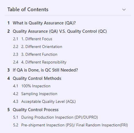
TOC is very useful (especially for articles with many chapters), visitors can easily understand the structure of the article and locate the corresponding content, making the browsing experience very good. The links to the TOC can also be indexed by Google and displayed in the search results (orange box below), which is very helpful to increase the article display rate and click-through rate!
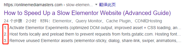
Article page must do article directory function! Now we build our clients' websites with a standard TOC on the article pages, and our mobile TOCs automatically shrink to follow the screen floating, not taking up space and not blocking the content, while making it easy for customers to click on the cell phone.View specific results.
Install the monitoring and tracking plugin
InstallationLucky OrangeThe website tracking plug-in, such as the one that automatically records screens and statistics for each customer service visit. You can clearly understand which pages customers clicked on, what content stayed longer, from which page jumped out of the site, and whether the process of sending inquiries encountered any problems. With this information, you can optimize the website content, structure, functionality, etc. to greatly improve the conversion rate.
Especially for Google Ads, modifying the content appropriately according to the customer's visiting behavior can improve the conversion rate.
Other
The following are some of the conversion rate and bounce rate impact may not be very large, and a little interesting content, written for your reference only.
1- Phone and email add links that can be clicked to bring up the mobile dial pad as well as the email client. This saves customers time and also allows Google Analytics to track conversions.
2- Jump to the thank you page after submitting a form inquiry, which allows Google Analytics to track conversions and let visitors know the form has been submitted. You can also set up an email to be sent to the visitor's email address automatically after submitting the form, with the content "We have received your message and will contact you as soon as possible, if you have any needs during the period or have not received a reply for too long, you can also contact us by replying to this email".
How to improve the conversion rate of cross-border e-commerce websites?
The following content is only related to 2C e-commerce website conversion rate
Competitive pricing
According toPrisync Research, 60% of 2C consumers consider pricing to be the primary criteria for their purchase decision. The most important factor driving purchase decisions (80%) is competitive price. Especially for cross-border e-commerce sites, price is always the most critical factor.
- 20% of e-commerce traffic in various product categories from price comparison engines.
- 73%'s webshop cites price changes as a major factor in competitive pressure.
- 54% shoppers will buy products that remain in their shopping carts if they are offered at a lower price.
- 46% online shoppers prefer to recreate the e-commerce store where products are compared (including prices).
- 41% of online shoppers looking for discount coupons, and 23% of them participated in these promotions.
- 60% of online female shoppers are more likely to spend time looking for the best price, a much higher percentage than the 46% of men.
- An average online shopper visits at least 3 websites before making a purchase.
- 62% of large market shoppers take the time to find the best deals. 46% on the average online site.
- The top 3 most influential factors for US shoppers when shopping online - 87% price / 80% shipping / 71% discount.
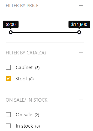
Statistics show that 75% users leave the site if they do not find what they are looking for within 15 seconds. Using product filters makes the process of searching for products easy and fast. Retain potential customers.
Cross-border e-commerce sites are strongly recommended to enableProduct (price) filtering function (below), which allows customers to quickly find the products within the target price. We built the e-commerce site list page are equipped with price filtering, but also according to product categories and attributes (color, size, etc.) to filter, very practical!
Themes like Astra Pro with price filters and other features, but very slow! Because the theme uses Woocommerce's own filtering, non-Ajax loading and involves more than 20 JS/CSS resources, it takes 3-4 seconds to load out.
Recommended usePofily-WooCommerce Product FiltersPlugin to create product (price) filtering, Ajax loading speed, powerful includes filtering by category, attribute, inventory, etc. Click to viewExample effect.
Foreign trade 2B customers are also very important price, many people think that customers care about quality, the price is higher does not matter. The actual situation is that customers will be inWithin the target priceLook for suppliers who are satisfied with the quality, and if it is out of the price budget range customers are likely to drop the high priced suppliers.
Most of our customers are buyers. The most important thing for us wage earners is to create profit for the company, and getting quality products at a good and reasonable price is the skill that buyers rely on.
Additional Product Information
A study showed that 64% of users began considering shipping costs on product pages, while 61% of users abandoned their orders in the last quarter due to additional costs. baymard's research suggests that key information like this should be placed in an easily visible place below the product purchase button.
Using the Trust Badge
The icon in the image below is the trust badge, and numerous studies have proven that trust seals have a significant impact on consumer behavior. According to research conducted by TNS, 79% shoppers expect to see a seal of some kind on the site's homepage. About 70% of users canceled their online orders because they did not "trust" the transaction.
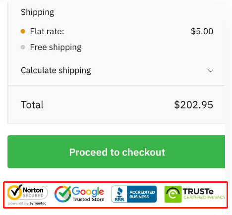
According to a study conducted by Actual Insights, among more than 75% respondents, the trustmark improved brand credibility. In addition, 61% participants said they recall a time when they chose not to complete a transaction due to the lack of a trustmark. Similarly, McAfee retailers noted a 12% increase in sales after using the McAfee Site Secure seal, according to Nuvonium.
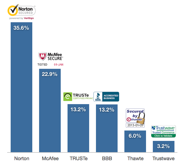
According toBaymard InstituteIn another study, Norton, McAfee, TRUSTe and the BBB Accredited seal were the most recognized and trusted badges among online shoppers.
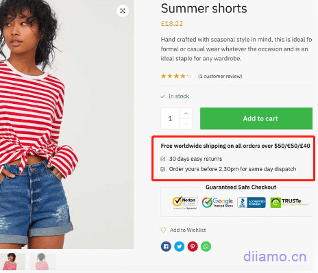
Encourage purchase
It's easy to add a timer sales countdown to each product as well as an animated inventory counter to convince customers to buy. This can be done using real data or virtual data to increase the sense of scarcity and accelerate potential purchases.
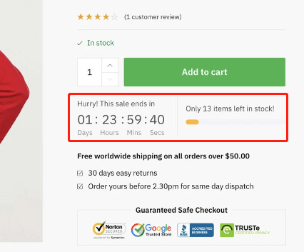
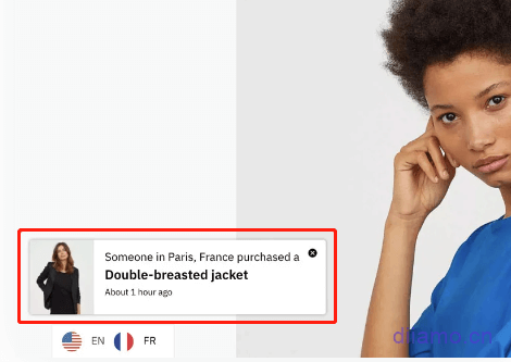
Add up-slide sales notification
Display recent orders on your website and increase conversions by highlighting other people's purchases. Display orders in real time and increase social proof. Create a sense of urgency and showcase new items to buy!
Newsletter Subscription
Subscription services are very popular abroad, especially for sales websites, and are very helpful for conversions. Once a customer submits an email address for a similar order, the merchant will send regular marketing emails to the subscriber to facilitate the transaction.

2C retail sites are recommended to add this subscription function, when there are new products, or holiday promotions (Black Friday) to send emails to subscribing customers to improve sales. 2B independent foreign trade sites are not recommended to do this function, because not many customers will subscribe to 2B class sites, but the competition will take advantage of the opportunity to copy the new.
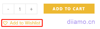
Add Wishlist function
Wishlist is a feature that allows customers to add their favorite products to a wishlist. This serves 2 purposes, one is to allow customers to share the wishlist with their friends and family so that they can purchase items for themselves, which is especially important during the holidays.
Foreign cultures are different from ours, they send links to products they want to their friends for their wedding and birthday, and ask them to buy them for themselves. With the wish list function, customers can add their favorite products to the wish list and send them to their friends and family via Whatsapp, Facebook, email, etc.
Another function of wishlist is to know which products are more popular among customers, and you can set up regular emails (with coupons) to customers to buy the products in the created wishlist, thus increasing the conversion rate and sales.
We recommend usingTI WooCommerce WishlistPlugin to create wish lists, it's better, more thoughtful, and most importantly, free! It can be set to automatically insert wishlist icons in the navigation, and will show the number of items inside the wishlist.
![]()
![]()

You can also set up automatic insertion of wishlist links in Woocommerce personal account center, which is very user-friendly.

We have also used YITH WooCommerce Wishlist plugin, which is also very good. But we like it more and recommend it moreTI WooCommerce Wishlist.
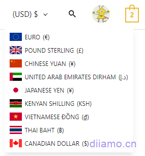
Multi-currency switching function
If stores only display prices in U.S. dollars, many cross-border shoppers who do not use U.S. dollars as their main consumption currency will lose judgment on prices. They can only open their cell phone exchange rate calculator and enter the price into local currency to determine the price of goods, which is very time-consuming and frustrating and greatly reduces the purchasing mood.
Cross-border e-commerce stores that install a multi-currency switch feature that allows customers to display product prices in their local currency.Very helpful to improve conversion rate and increase orders.
I have downloaded and compared almost 10 multi-currency switching plugins, of which ease of use,Aestheticsand the best compatibility isCURCY - WooCommerce Multi CurrencyPlug-in, recommended.
Optimize/add product evaluation function
It is well known that displaying product reviews can increase customer conversion rates by almost 270%! This only shows that people are highly influenced by ratings and reviews. It makes sense to equip products with an Amazon-style review and filtering system that provides customers with the review features they expect and allows them to send photo and video reviews.
Independent station at the beginning there is no product evaluation, you can install some plug-ins to add their own evaluation, or importQuick SaleThe reviews of similar products on similar platforms.
Optimize the shopping process
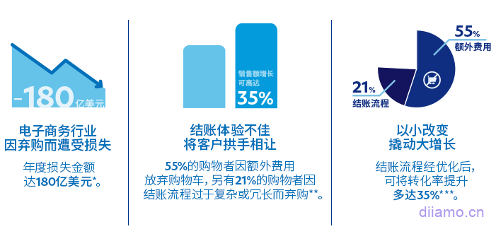
We read an article about how one of the main factors that causes customers to abandon a purchase is that they find the registration and payment process too cumbersome. So the simpler the checkout process, the fewer the steps, the better! We built a cross-border e-commerce standalone site to simplify the payment process as much as possible, with as little text as possible on the payment interface and as little information as possible for customers to fill in.
As mentioned above, most of the orders from 2C cross-border e-commerce standalone sites are the result of impulse spending by visitors, gambling on the "impulse" of customers, and the goal of 2C websites is to be fast, so that customers can make decisions quickly and complete payments quickly. If your website's theme checkout process is not simple enough, we recommend installingCartFlows Pro PluginProduce beautiful converting checkout process and interface that can be directly imported into the template easily and simply.
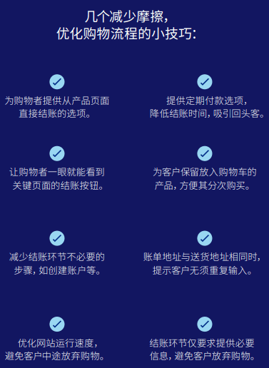
Shopping cart abandonment redemption function
One study found that nearly69% Abandoned Cart Pro for WooCommerce is a plugin that helps you get back customers who abandoned their payments.
When the customer abandons the payment at the payment screen, the plugin will send a message to the customer via email, SMS text or even Facebook Messenger to remind them to come back and finish the payment. Coupons can be sent to customers at the same time to increase the persuasion.
Every day several customers abandon their shopping carts, and while the abandonment recovery feature is unlikely to win back all of your customers, it will definitely return some of those potential customers to your store. Even just a few successes can make a significant contribution to your business growth.
Checkout page showing product thumbnails
Woocommerce checkout page does not show product thumbnails and quantity selectors by default, if it shows pictures and selectors, customers can clearly know which product the name corresponds to and can modify the product quantity without exiting the checkout page, improving conversion rate and reducing abandonment rate.
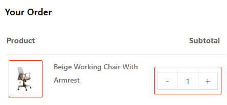
Copy and paste the following code to the bottom of Appearance>Theme File Editor>functions.php
//checkout page display product thumbnail,70 is thumbnail display size
add_filter( 'woocommerce_cart_item_name', 'bbloomer_product_image_review_order_checkout', 9999, 3 );
function bbloomer_product_image_review_order_checkout( $name, $cart_item, $cart_item_key ) {
if ( ! is_checkout() ) return $name;
$product = $cart_item['data'];
$thumbnail = $product->get_image( array( '70', '70' ), array( 'class' => 'alignleft' ) );
return $thumbnail . $name;
}
What other factors do you think affect the conversion rate of independent sites? Welcome to discuss in the comments below, we will properly adopt the update to the article inside.